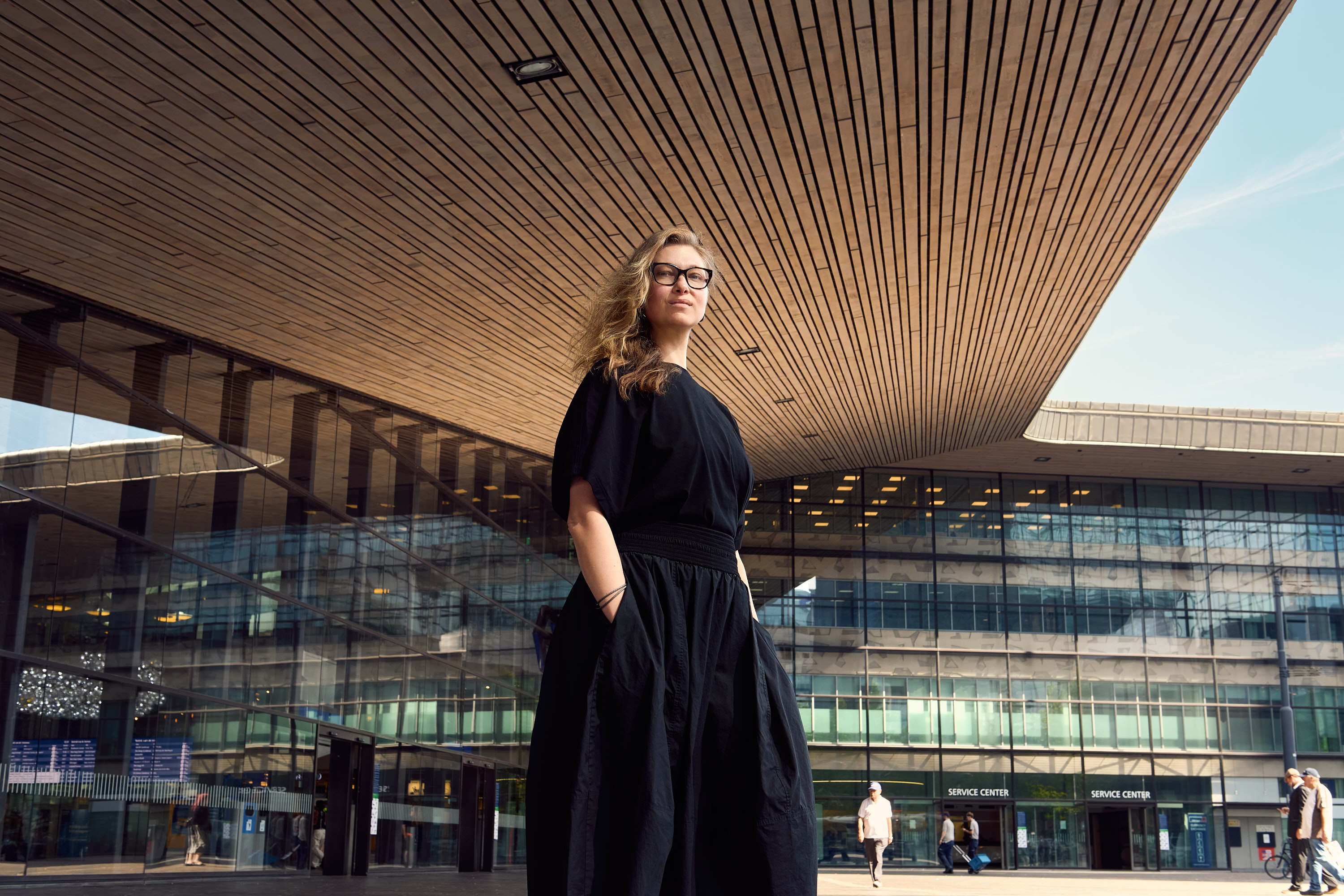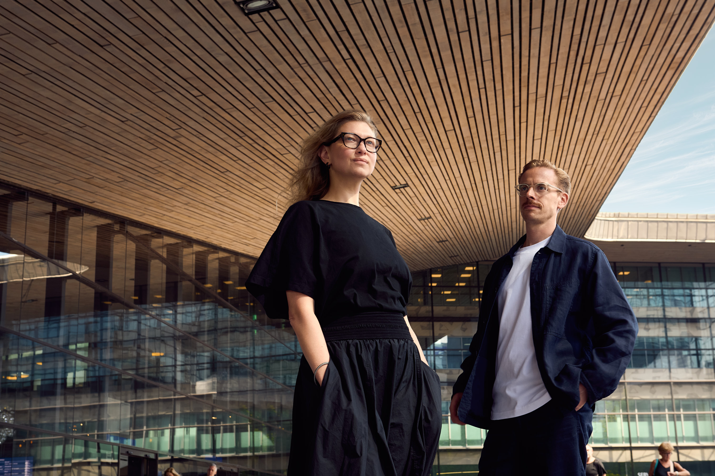
Angelina Severino, Lebara’s Global Design & UX Lead, speaks with our founder Roman Stikkelorum about making the internal case for change. And what happens when a brand finally catches up with its product.
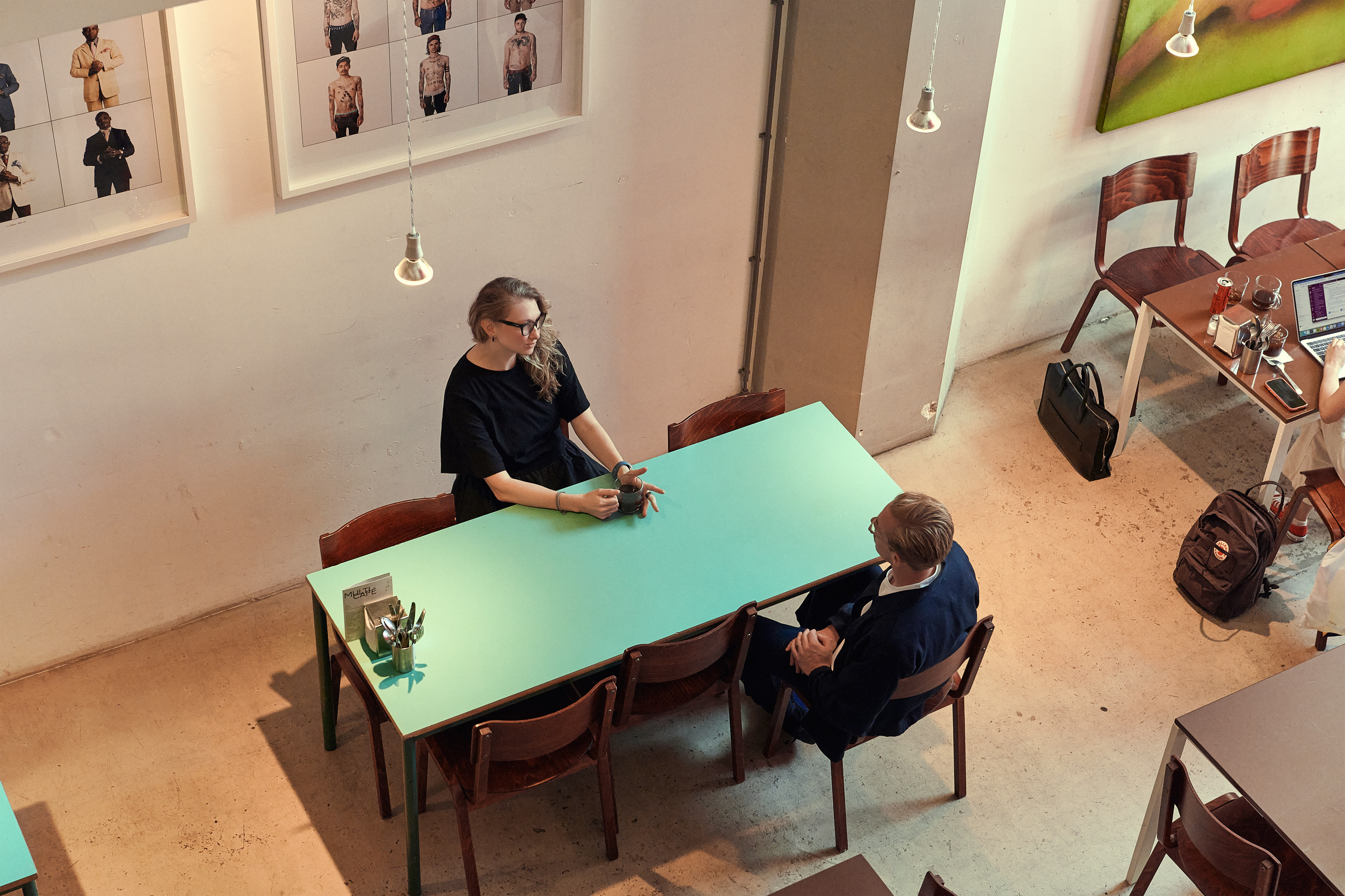
Lebara had everything a mobile operator needs to win: a reliable network, competitive pricing, and loyalty most competitors could only envy. The one thing it didn't have was a brand identity that reflected any of it. The last rebrand dated back to 2018, and by the time Angelina Severino joined as Global Design and UX Lead, that mismatch between product and perception had turned into a real business problem.
Solving it meant a new brand identity, but that had to be won internally first, before any creative work could start. Here, she walks through how she built that case across five markets, why the system behind the brand mattered more than the logo itself and what comes next now that the identity work is done.
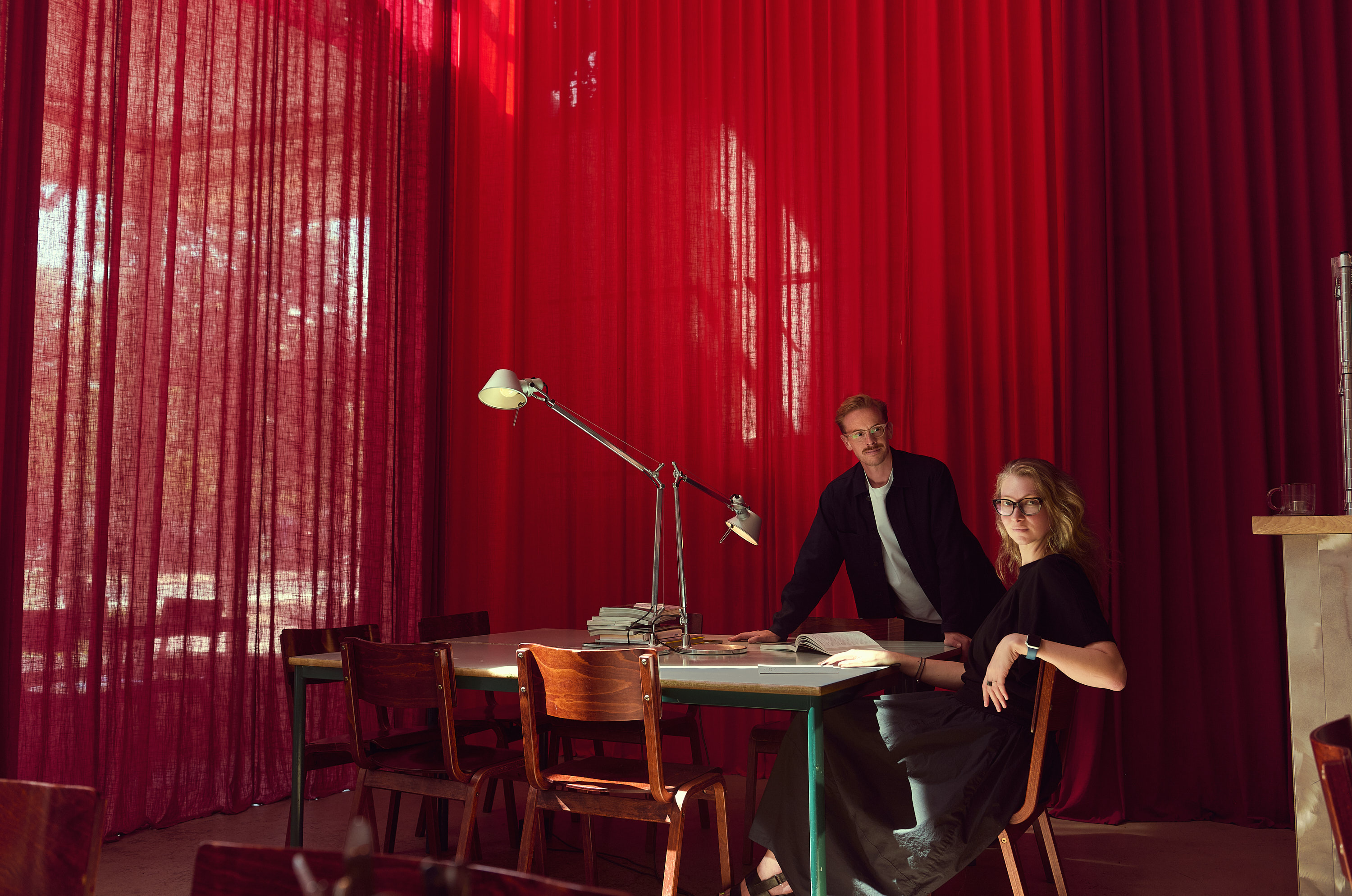
You arrived at Lebara to find a strong product and a brand that wasn’t keeping pace with it. How clear was that gap when you first got there? And what did it actually cost the business?
When I arrived, I found a company that was super progressive, super fast, modern, and agile, but whose brand told a completely different story. The last rebrand was around 2018. Lebara had a genuinely strong product. Great network, honest pricing, real flexibility. But something was not adding up. The message of Lebara being one of the best providers on the market was not coming across in the right way.
The research showed a clear opportunity: while the business and proposition had evolved, the brand identity hadn’t fully evolved with it. There was a growing gap between the quality of the service Lebara offered and how the brand presented itself.
That made the rebrand about more than creating a new look. It was about building an identity that better reflected the modern, ambitious and increasingly digital business Lebara had become.
There is a version of this story at almost every company we work with. The product or digital design team has already shipped the future, and the brand is still describing the past. Closing that gap is the job.
“The business had moved forward, but the brand identity hadn’t quite kept pace.”
When Verve presented the concept “Join a smarter perspective on mobile” for the first time, how did it land?
It was love from the first pitch. The strategic problem it solved was one we had been wrestling with for a long time. What made this concept work was that it was not just a line of copy. It was a worldview that the visual language could follow and reinforce.
When the concept is strong and followed by the visual language, everything gets connected. We knew that we could finally align all the brand touchpoints, because the identity would translate into everything we need.
The brand has to work across five European markets, the Middle East, Africa, and now the US. What did you build to make that possible?
When we were presenting the identity to different markets, some pushed back. The dynamic typography, the bold aesthetic, the loud expressive energy. Looking back, it wasn't really pushback on the expressive energy itself, it was about finding the right tone and level of expression for each market's audience. It wasn’t landing everywhere. The concept was great, but they needed a more flexible system.
One brand. Three volumes.
The volume button was the answer. Three levels of expression built into the same system. Volume one is calm and simple: clean typography, the logo, strong imagery. The language is strong enough without being dynamic at all times. Volume two introduces perspective into the typography, plays with more colour. Volume three goes fully expressive: biggest typography, most dynamic imagery, bold colour combinations. Go crazy.
It also had a practical dimension: not every market team has the design capability to produce highly expressive work. The volume system meant every market could show up in the brand regardless of their resources. The UK skews toward an older audience, so volume one works best there. Denmark's Nordic sensibility also leans toward volumes one and two. France is younger and more energetic, and that's where the dynamic typography really comes alive. Same brand, different volume, depending on who's listening.
Most global brands solve consistency by removing everything that could go wrong, and what is left is safe and invisible vanilla.A system that only works when your best designer touches it isn't a system.
Before any customer sees a new brand, the people inside the company have to believe in it. What did it actually take?
Getting people to let go of something familiar and trust something new takes time and repetition. My approach was to keep people constantly in the loop, to always let them know what’s happening, what’s new, what we are working on.
The turning point was a brand roadshow that David, Lebara’s Brand Lead, and I ran internally. It was deliberately light-touch: three sessions, around 160 people each time, in the office and over Teams. Rather than talk people through it, we let the work speak for itself, showing the full arc of the work: the concept itself, and how it translates to web, animations, and new product launches. People were reaching out saying wow, it’s amazing what you have done. Capybara, Lebara’s internal mascot, became one of the symbols of the internal shift. Everybody wants to use Capybara in their materials. There was merch too: bottles with the new logo one week, t-shirts featuring Lebara the capybara the next.
Most rebrands fail in a meeting room in month four, when someone senior who was never involved sees it for the first time. The work is not only designing the brand. It is designing the process, designing buy-in and the arguments that survive that room.
“Communicate way more than you even think is comfortable. Repeat it over and over again. Come up with all the examples of how it works. Once people are involved, understand the system, and see it solve key issues, they turn into brand supporters.”
What did this actually cost you, and what would you tell someone about to fight the same internal battle?
It cost more than the project itself did. I'd just joined Lebara, so I had none of the track record that usually buys you trust. Every objection had to be answered on the spot, with evidence, because I had no goodwill reserve to fall back on. The UK team took the most convincing, they run our biggest market, so the stakes were highest for them, and honestly, I'd have pushed for the same scrutiny in their position.
If I started again, I'd lead with education before evidence, before the ask. Designers live in research like the McKinsey Design Index, but that fluency isn't universal, and I underestimated that. My advice to anyone starting this fight: be more patient than feels natural. Give people just enough context to follow your thinking at each stage. What looks like a brand refresh on paper can turn into a multi-year business transformation in practice.
A brand only lives if the people inside it believe in it. So we build the work with them, in the open, across multiple sessions where every voice has somewhere to land. By the time the new brand is revealed, it already belongs to them. That is the difference between a rebrand that gets announced and one that gets adopted.
A lot of rebrands stop at the visual identity and call it done. You’re treating UX as the next chapter. Looking ahead, where is this brand in three to five years?
Branding is UX. That is my motto, and it drives the next phase of the work. The brand values of simplicity, speed, and modernity cannot live only in how Lebara looks. They have to be felt in how Lebara works. If the brand says smart perspective, that means smooth, frictionless, fast. That runs from the TV ad through the digital journey, customer support, and checkout. Every one of those moments now has to deliver on what the brand promises, right down to a chatbot reply that's on-brand in tone. That makes this bigger than a design team's job. Every department now has a role in living the brand.
The foundations are now in place and the ambition is clear.
And I want to be honest about the complexity of connecting design directly to business outcomes. It is extremely difficult to prove it was exactly the design that changed brand perception, because it is always a combination of things. What we have done is run qualitative research,with positive results. Quantitative research follows.
Angelina is being more honest here than most clients would be. But the premise deserves pushing back on. Nobody asks the sales team to isolate their contribution from the product, and nobody asks the product team to isolate theirs from pricing. Design is the only function expected to prove it acted alone.
“One person on our UK team told me that after the digital launch, he could finally tell his friends where he worked, because if they looked Lebara up now, he'd be proud of what they'd see.”
A brand used to be something people looked at separately. Now it is something people move through, engage with and increasingly something machines read on their behalf. When a customer asks an AI assistant which provider to choose, that assistant is judging your brand without ever seeing your typography.
This is the kind of work Verve does best: helping ambitious brands close the gap between what they build and what people believe about them.
If your brand isn't keeping pace with your product, let's talk.